Here I’ll show, you step by step, how to produce the plot in the tweet below. You can use it to show explicitly (and redundantly, but this is not always bad) absolute and relative changes among points in a time series.
Late #TidyTuesday , #dataviz
— Otho (@othomn) February 1, 2019
Visualization practice, I'm showing consumption of butter and its percent change compared to the previous year.
I did this plot on “butter” just because its consumption changes.
Source: https://t.co/yNp2qkOVO5
Code: https://t.co/flNedKO1kh pic.twitter.com/yoTHspwBxZ
To produce this plot, you just need to mix components from ggplot2, and the wonderful scico colour palette.
1 Load Packages
First you need to load the required R packages.
library(tidyverse)
library(tibbletime)
library(scico)
The tidyverse is a collection of packages for data analysis, that contains the functions that we will use to load, manipulate and plot the data.
The package tibbletime stores the function rollify. This function allows you to apply another function, such as mean or sum over windows of time, or, as the name says, to “roll”" it.
The package scico stores wonderful color palettes, but more about that later.
2 Get the data
I use this snippet of code to download data automatically and only once.
# Get data Milk products ---------------------------------------------------

dat_path <- "_data/2-05-milk-product-facts.Rdata"
dat_url <- paste0("https://raw.githubusercontent.com/",
                  "rfordatascience/tidytuesday/master/data/",
                  "2019/2019-01-29/milk_products_facts.csv")

if(!file.exists(dat_path)) {
  dat_milkprods <-
    read_csv(dat_url)

  save(dat_milkprods, file = dat_path)

} else {
  load(dat_path)
}
The original data come from USDA, but this version has been already tidied by Thomas Mock as part of the of the TidyTuesday, a weekly social data project that he organizes. So we have little data manipulation left to do.
The milkprods dataset is already tidy, but it stores many columns that we don’t need.
dat_milkprods %>% print()## # A tibble: 43 x 18
## year fluid_milk fluid_yogurt butter cheese_american cheese_other
## <int> <int> <dbl> <dbl> <dbl> <dbl>
## 1 1975 247 1.97 4.73 8.15 6.13
## 2 1976 247 2.13 4.31 8.88 6.63
## 3 1977 244 2.34 4.29 9.21 6.78
## 4 1978 241 2.45 4.35 9.53 7.31
## 5 1979 238 2.44 4.49 9.60 7.57
## 6 1980 234 2.50 4.47 9.62 7.90
## 7 1981 230 2.44 4.24 10.2 8.03
## 8 1982 224 2.58 4.35 11.3 8.60
## 9 1983 223 3.16 4.91 11.6 8.96
## 10 1984 224 3.55 4.98 11.9 9.62
## # ... with 33 more rows, and 12 more variables: cheese_cottage <dbl>,
## # evap_cnd_canned_whole_milk <dbl>, evap_cnd_bulk_whole_milk <dbl>,
## # evap_cnd_bulk_and_can_skim_milk <dbl>, frozen_ice_cream_regular <dbl>,
## # frozen_ice_cream_reduced_fat <dbl>, frozen_sherbet <dbl>,
## # frozen_other <dbl>, dry_whole_milk <dbl>, dry_nonfat_milk <dbl>,
## # dry_buttermilk <dbl>, dry_whey <dbl>3 Wrangle and Estimate Percentage Changes
We need just 2 variables (year and butter) and we can easily extract them with dplyr::select.
A bit more complex: we need to estimate percentage changes from the day before. This is swiftly done with rollify. We can use this function factory to build the function roll_percent(), which calculates percentage change over a column of a data frame.
# Percent ---------------------------------------------------------

# roll percent over a dataframe
roll_percent <- rollify(.f = function(n) (n[2] - n[1])*100/n[1], 2)

dat <-
  dat_milkprods %>%
  select(year, butter) %>%
  # apply on this dataframe, on the column butter
  mutate(percent = roll_percent(butter)) %>%
  filter(complete.cases(.))
So, this is the clean data frame that we use for plotting:
dat %>% print()## # A tibble: 42 x 3
## year butter percent
## <int> <dbl> <dbl>
## 1 1976 4.31 -8.78
## 2 1977 4.29 -0.441
## 3 1978 4.35 1.41
## 4 1979 4.49 3.14
## 5 1980 4.47 -0.528
## 6 1981 4.24 -5.13
## 7 1982 4.35 2.67
## 8 1983 4.91 12.8
## 9 1984 4.98 1.42
## 10 1985 4.87 -2.09
## # ... with 32 more rows4 A bit of style
You can set the plot styles at any time, let’s do it now.
Below I modify the theme_minimal from ggplot2 with some fonts and colours that I like. I devised and and modified this from what Kieran Healy does.
theme_set(
  theme_minimal() +
    theme(text = element_text(family = "Arial Narrow",
                              colour = "grey40",
                              size = 11),
          axis.title = element_text(size = 14),
          plot.title = element_text(colour = "grey20",
                                    face = "bold",
                                    size = 18),
          plot.subtitle = element_text(face = "bold",
                                       size = 12),
          aspect.ratio = .6,
          plot.margin = margin(t = 10, r = 15, b = 0, l = 10,
                               unit = "mm"))
)
You can see setting a theme with theme_set() in ggplot2 as if you where applying a CSS file to your website. All plots below will be produced according to this theme.
5 Plotting (aka the fun part ;) )
Obviously, we will produce this plot with ggplot2.
5.1 Set the basic aesthetic mapping
First you can set the basic aesthetic mapping. All elements of the plot will have the variable year mapped to the x axis and butter mapped to the y axis.
Below, I also use a small dplyr trick to setting the yend variable, just before plotting. This variable doesn’t add anything to the dataset and I just need it when I plot the percentage changes, to make them look nice and clear.
With the tidyverse and ggplot2 you have at least two choices for setting variables on the fly:
- Right before plotting, in a pipe, as I’m doing here.
- Directly within
ggplot2when you define the aesthetic mapping, as I will do later.
p <-
  dat %>%
  mutate(yend = butter + (percent/10)) %>%
  ggplot(aes(x = year,
             y = butter))
At this point I’ve mapped basic aesthetic to the plot, but I did not specify any geometric object: this the plot is empty.
p %>% print()
5.2 Add the first geometric objects
I’ll start with the grey annotation square, and the text, just because I want them to appear below any other object of the plot.
Then I add the key geometric elements, the points, that are mapped to the absolute value of the butter sold in the US (lbs per person) and the arrows that are mapped to the percentage changes.
Note: you can call aes() inside a call for a geometric object, as I do for geom_point(). In this way you can map a variable to an aesthetic parameter exclusively for that geometric object.
p <-
  p +
  # First the annotations
  annotate(geom = "rect",
           xmin = 2008, xmax = 2010,
           ymin = -Inf, ymax = Inf,
           fill = "grey80", alpha = .5) +
  annotate(geom = "text",
           x = 2009, y = 4,
           label = "2008\nEconomic Crisis?",
           family = "Arial Narrow",
           colour = "grey40",
           size = 3, fontface = "bold") +
  # and then the basic geometric objects
  geom_segment(aes(yend = yend,
                   xend = ..x..,
                   colour = percent),
               size = 2,
               arrow = arrow(length = unit(1.2, "mm"),
                             type = "closed")) +
  geom_point(colour = "grey40", size = 2)

p %>% print()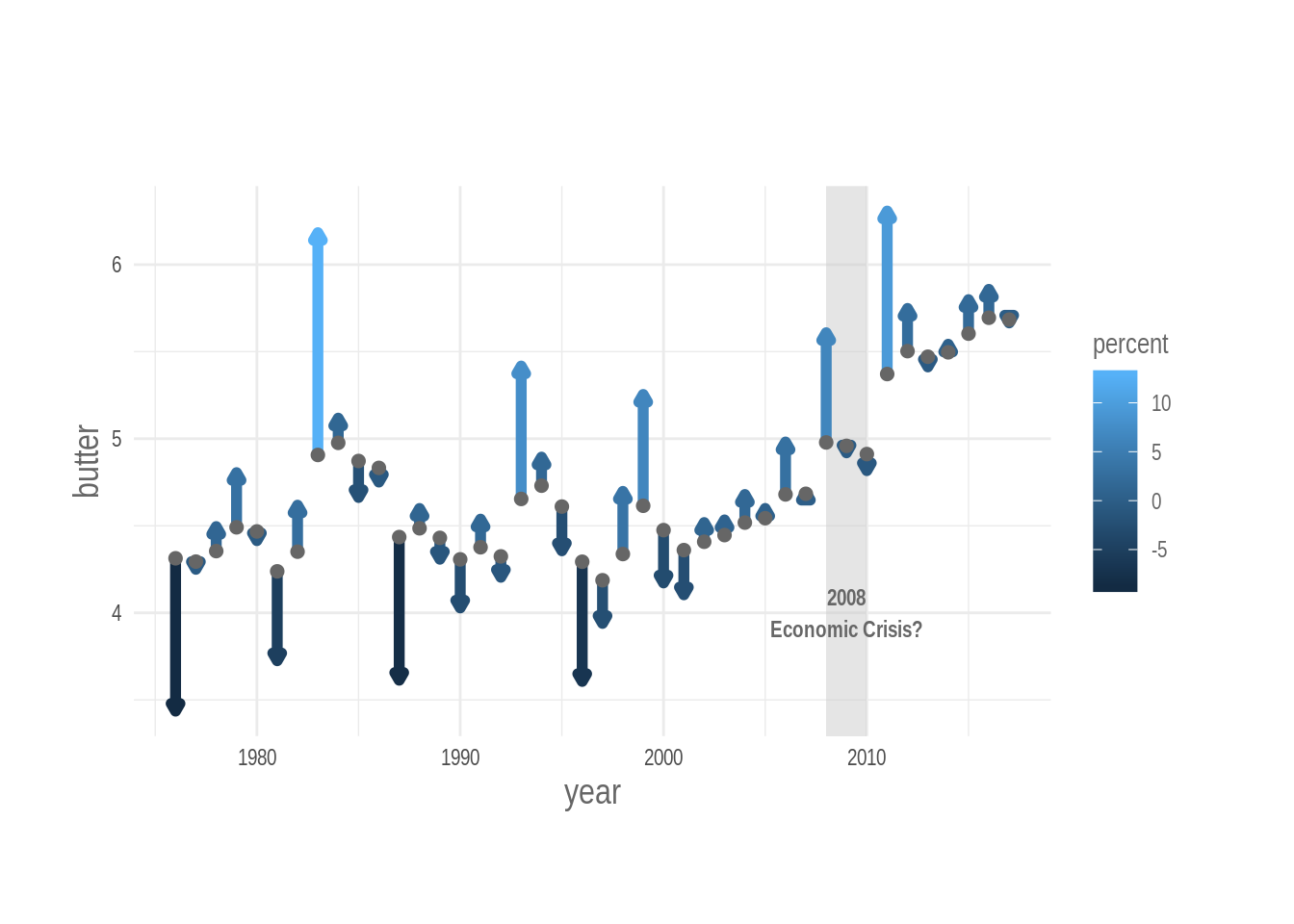
5.3 Specify percent changes explicitly
We can specify percent changes explicitly with numbers, in this way, readers can learn the specific size of the effect easily.
I’ll do it with geom_text().
The numbers must appear above the arrow if the percentage change is positive, and, below, if it is negative. We achieve this using case_when(): a vectorized ifelse statement. I use case_when() directly in the call to the aesthetic mapping.
p <-
  p +
  geom_text(aes(y = case_when(percent > 0 ~ yend + .12,
                              TRUE ~ yend - .12),
                label = percent %>%
                  round() %>% paste0("%"),
                colour = percent),
            size = 2.7)

p %>% print()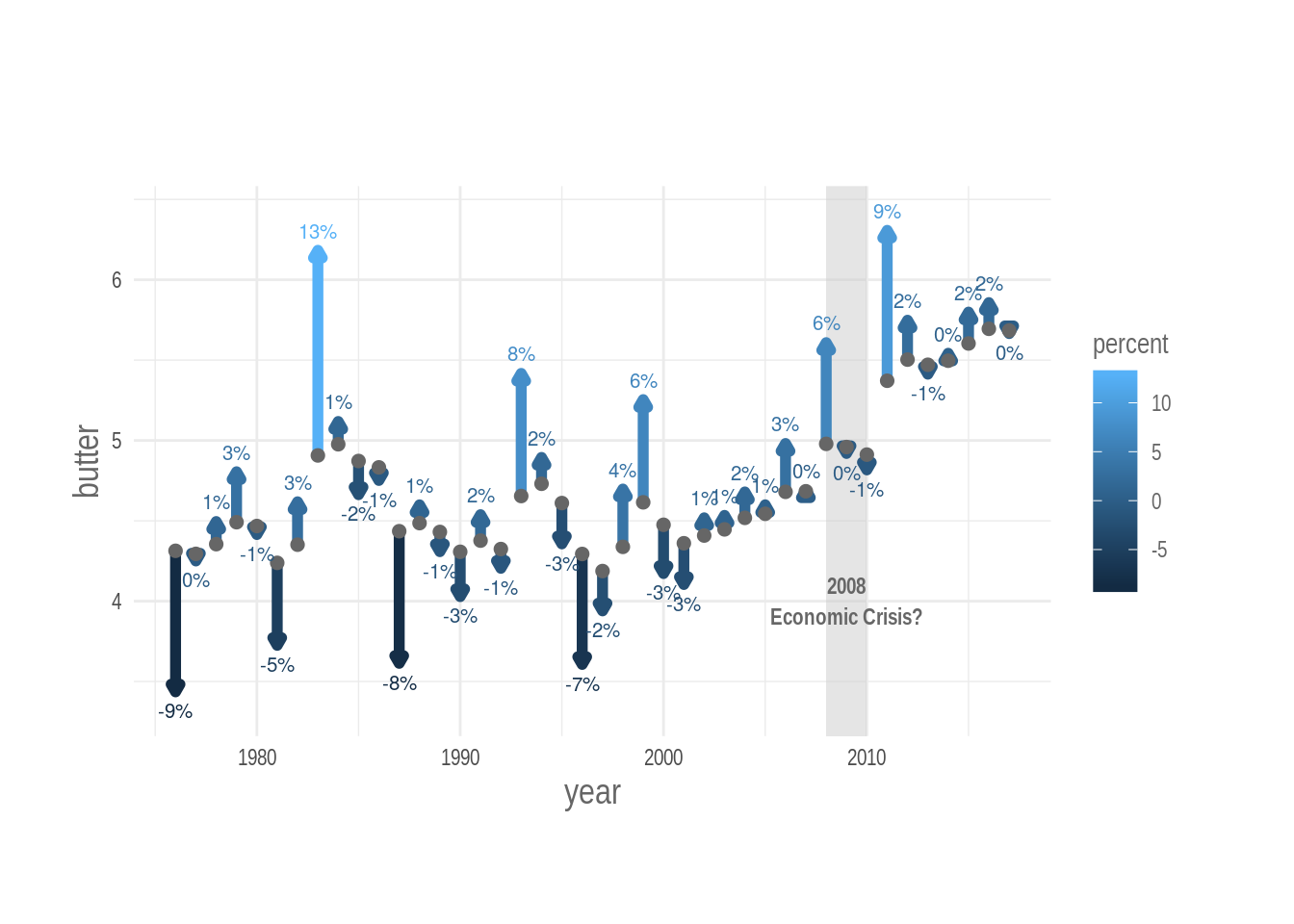
5.4 Colors colors colors
Colors: are they necessary? Are they to be avoided? The debate on what is the best way to use colors in a graph is wide and, well, colorful (forgive me ;) ). Well, colors, they make your plot look good, and for sure they can be helpful. How can we get the most out of them.
Beside looking good, a colour palette today must have two properties:
- Be colour blind friendly (no need to explain this),
- Be perceptively uniform, or at least perceptively reasonable (i.e. it should not let you guess pattern that are not in the data).
The concept of perceptively uniform is explained clearly in the vignette of the viridis package.
Beside the beautiful viridis palette, I also love those in the package scico. This package was developed by Thomas Lin Pedersen and it ports into R the color palettes developed by Fabio Crameri. I use the roma scale, which is divergent and colorful, and map percent change to it.
# the roma palette
scico::scico_palette_show(palettes = "roma")
I want the light and clear center of the divergent palette to be mapped to the 0% changes, so that the negative changes are red and the positive ones are blue. But percentage changes are not equally distributed around zero (since they are hopefully not random) so we can do it manually by setting artificial upper and lower limits to the colour mapping that are equally distant from zero.
After doing that we can set the new color palette to the plot with the scale_colour_scico() function. Note that I have removed the lateral color guide with guide = FALSE, because it is not needed. In this way I free some space on the plot canvas.
# a limit that centers the divergent palette

lim <-
  dat$percent %>%
  range() %>%
  abs() %>%
  max()

p <-
  p  +
  scale_colour_scico(palette = "roma",
                     direction = 1,
                     limits = c(-lim, lim),
                     guide = FALSE)

p %>% print()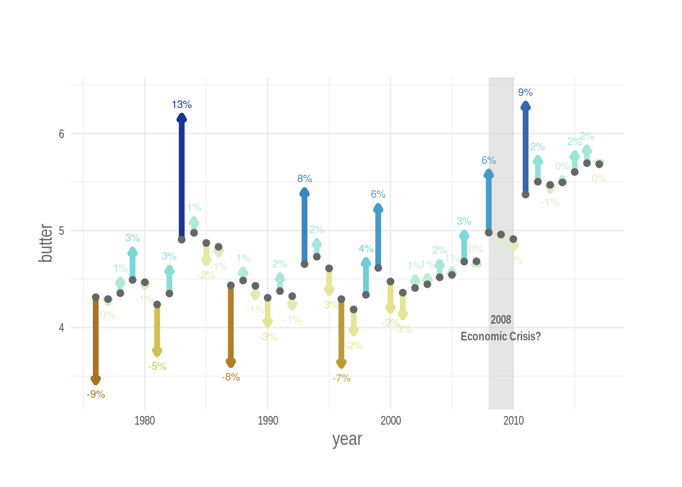
5.5 Title axis and caption
After that it’s just a matter of adding a title, a description, a caption and better labels for the axes.
Note, in the original tweet I got the y axis label wrong. It should say “lbs per person”.
p <-
  p +
  labs(title = "Fluctuations in Butter Consumptions",
       subtitle = str_wrap("In the US between 1975 - 2017,
                           with weight of sold butter in lbs
                           and its percent change compared to
                           the previous year."),
       y = "Sold Butter in lbs per person",
       x = "Year",
       caption = "Data: USDA | Plot by @othomn")
p %>% print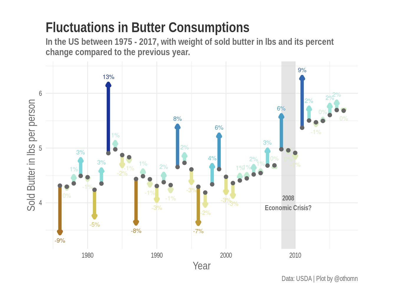
# Save -----------------------------------------------------------------

png(filename = "_plots/2-05-milk.png",
    height = 1600, width = 2100,
    res = 300)
p %>% print()
dev.off()
## png
## 26 Automate With a Function
We can produce this plot from the original dataset with just one line of code if we place all steps in a function. I just leave out the title and subtitle that are different for each plot
plot_arrows <- function(measure = butter) {
  # quote input
  measure <- enquo(measure)


  dat <-
    dat_milkprods %>%
    select(year, !!measure) %>%
    # apply on this dataframe, on the column butter
    mutate(percent = roll_percent(!!measure)) %>%
    filter(complete.cases(.))

  # parameters to center the color palette
  lim <-
  dat$percent %>%
  range() %>%
  abs() %>%
  max()

  p <-
    dat %>%
    # Scale the arrow to the intensity of the measurement
    # In this way the arrow looks nice and clear in the plot
    # This step must be improved
    mutate(yend = !!measure + (percent)*(max(!!measure)/20)) %>%
    ggplot(aes(x = year,
               y = !!measure)) +
    # and then the basic geometric objects
    geom_segment(aes(yend = yend,
                     xend = ..x..,
                     colour = percent),
                 size = 2,
                 arrow = arrow(length = unit(1.2, "mm"),
                               type = "closed")) +
    geom_point(colour = "grey40", size = 2) +
    geom_text(aes(y = case_when(percent > 0 ~ yend * 1.02,
                                TRUE ~ yend * 0.97),
                  label = percent %>%
                    round() %>% paste0("%"),
                  colour = percent),
              size = 2.7) +
    scale_colour_scico(palette = "roma",
                       direction = 1,
                       limits = c(-lim, lim),
                       guide = FALSE)

  p
}

plot_arrows(fluid_milk)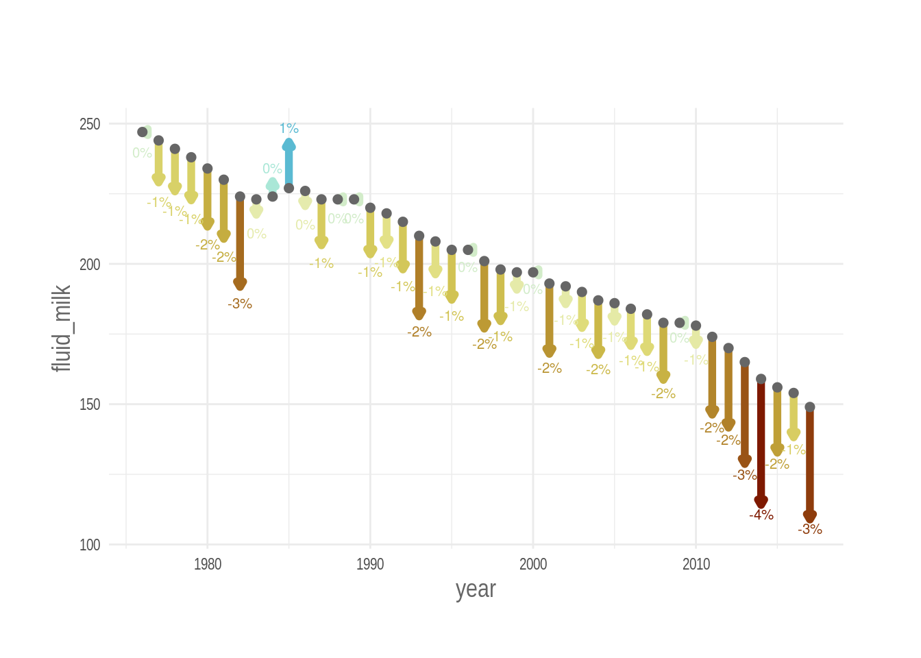
plot_arrows(cheese_other)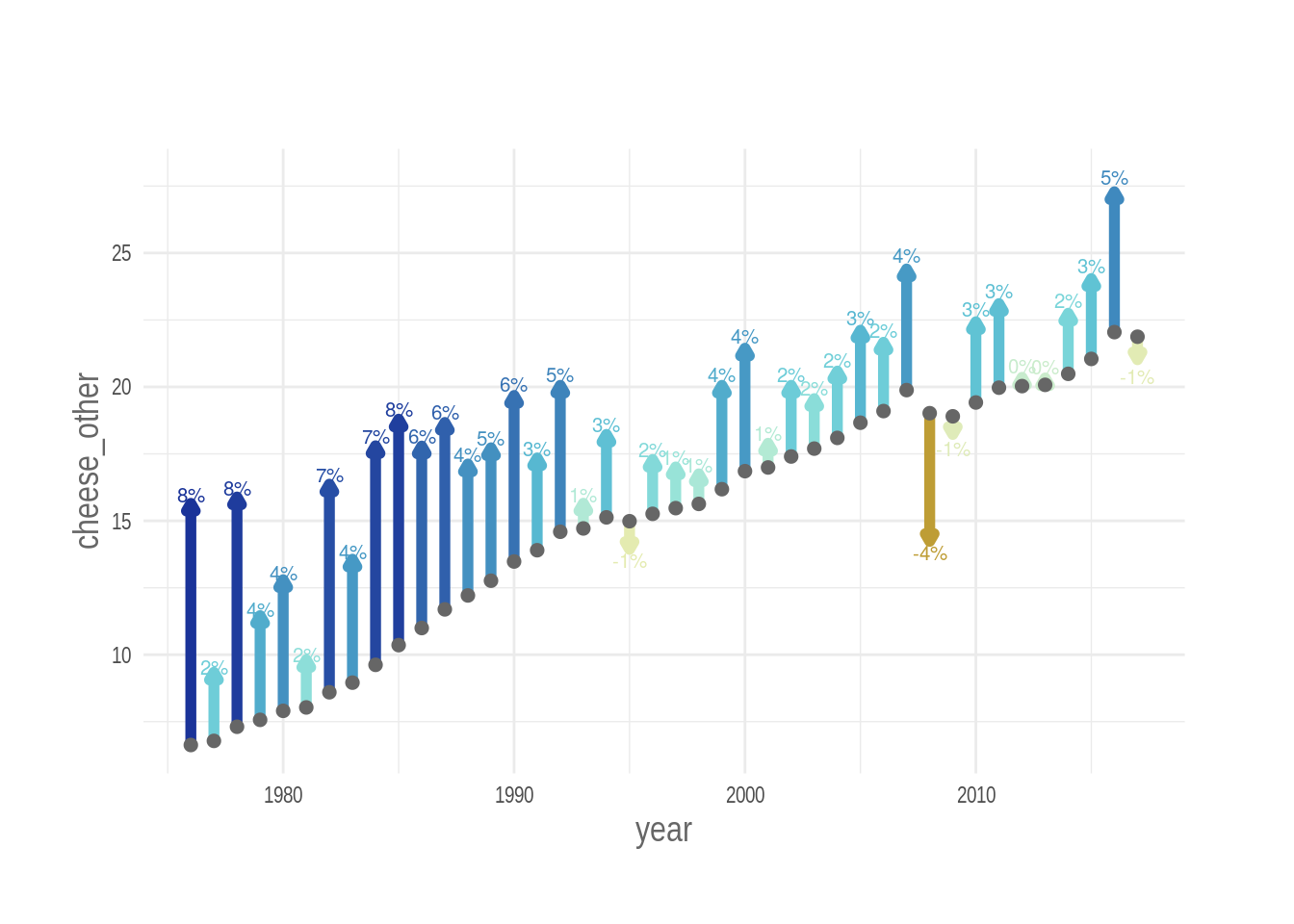
7 Waterfall charts
Last but not least, Gina Reynolds suggested that one could misintepret the plots above, and understand that the mesurements points are at the top of the arrows instead than at the bottom.
She suggested that a waterfall chart could fix this issue and provide a more direct visualization, indeed a waterfall chart does its job.
roll_prev <- rollify(.f = function(n) n[1], 2)

dat <-
  dat %>%
  mutate(prev_year = roll_prev(butter)) %>%
  filter(complete.cases(.))

half_rect <- .3

p <-
  dat %>%
  mutate(yend = butter + (percent/10)) %>%
  ggplot(aes(x = year,
             y = butter)) +
  annotate(geom = "rect",
           xmin = 2008, xmax = 2010,
           ymin = -Inf, ymax = Inf,
           fill = "grey80", alpha = .5) +
  annotate(geom = "text",
           x = 2009, y = 4.2,
           label = "2008\nEconomic Crisis?",
           family = "Arial Narrow",
           colour = "grey40",
           size = 3, fontface = "bold") +
  # geom_line(color = "grey80") +
  geom_rect(aes(xmin = year - half_rect,
                xmax = year + half_rect,
                ymin = prev_year,
                ymax = butter,
                colour = percent,
                fill = percent), size = 0) +
  geom_segment(aes(x = year - half_rect,
                   xend = ..x.. + 1 + half_rect*2,
                   yend = ..y..),
               colour = "grey40", size = 1) +
  geom_text(aes(y = case_when(percent > 0 ~ butter + .05,
                              TRUE ~ butter - .05),
                label = percent %>%
                  round() %>% paste0("%"),
                colour = percent),
            size = 2.7) +
  scale_colour_scico(palette = "roma",
                     direction = 1,
                     limits = c(-lim, lim),
                     guide = FALSE) +
  scale_fill_scico(palette = "roma",
                     direction = 1,
                     limits = c(-lim, lim),
                     guide = FALSE) +
  guides(colour = element_blank()) +
  labs(title = "Fluctuations in Butter Consumptions",
       subtitle = str_wrap("In the US between 1975 - 2017,
                           with weight of sold butter in lbs
                           and its percent change compared to
                           the previous year."),
       y = "Sold Butter in lbs per person",
       x = "Year",
       caption = "Data: USDA | Plot by @othomn") +
  theme_minimal() +
  theme(text = element_text(family = "Arial Narrow",
                            colour = "grey40",
                            size = 11),
        axis.title = element_text(size = 14),
        plot.title = element_text(colour = "grey20",
                                  face = "bold",
                                  size = 18),
        plot.subtitle = element_text(face = "bold",
                                     size = 12),
        aspect.ratio = .6,
        plot.margin = margin(t = 10, r = 15, b = 0, l = 10,
unit = "mm"))

p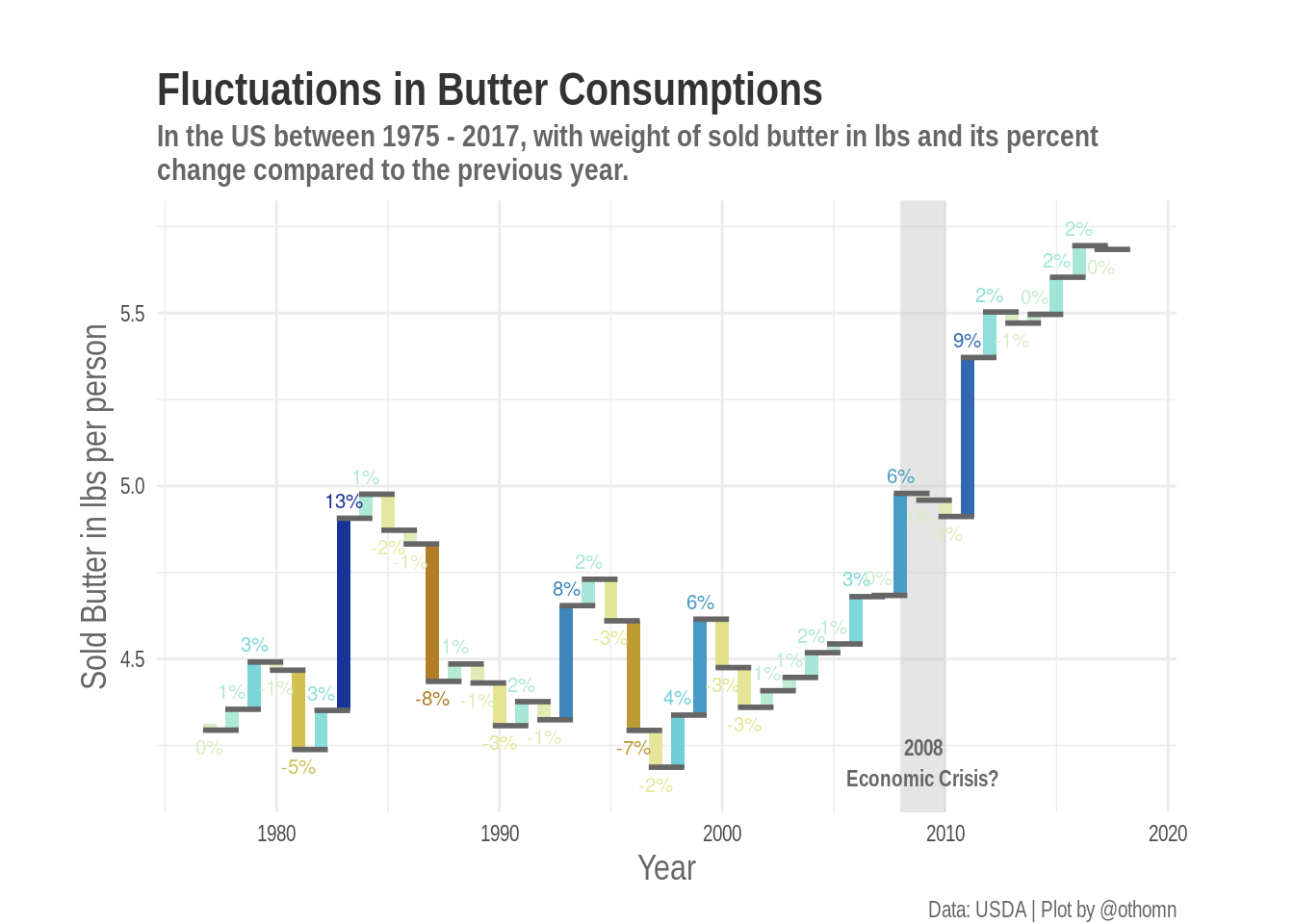
I think that the waterfall chart indeed solves this issue, but that the version with the uses the area in the canvas differently and stresses relative changes more.
So you can choose which chart to use depending on your needs. What do you think?