1 Intro
This is week 4 of the social data project TidyTuesday. In this week, we explore the incarceration trend dataset. This dataset stores US demographic and incarceration data by county and by gender / ethnic profile for the last 30 years.
The incarceration trend dataset is kindly provided by the Vera Institute on their Github page. Analyzing this dataset aims at remembering of the social injustices still present in our world on Martin Luther King Jr. Day.
For this analysis, I want to practice modelling rather than data wrangling and tidying, so I decided to start from the file prison_population.csv, from Tidytuesday’s github page which has already been tidied by Thomas Mock.
# Setup -------------------------------------------------------------------
library(tidyverse)
theme_set(theme_bw())
# Get Data ----------------------------------------------------------------
# download data directly from github and store them as Rdata locally.
dat_path <- "_data/2-04-prison.Rdata"
dat_url <- paste0("https://raw.githubusercontent.com/",
"rfordatascience/tidytuesday/master/data/",
"/2019/2019-01-22/prison_population.csv")
if(!file.exists(dat_path)) {
dat <- read_csv(dat_url)
save(dat, file = dat_path)
} else {
load(dat_path)
}2 A strategy for missing values [NA]
Collecting such detailed data is a massive effort, and some missing values are inevitable. For statistical modeling we must select a clear and explicit strategy to deal with measurements that are mixed with missing values.
The dataset prison_population.csv has many missing values stored as NA in the column prison_population. That column counts incarcerated individuals, and it is our main interest together with the population columns that stores a full population census.
# how many NAs in the variable prison_population?
dat$prison_population %>% is.na() %>% sum()
## [1] 7517872.1 Ignore the NAs
A very basic strategy, could be just to ignore the NAs. We can try to plot a quick summary of prison population by state, using sum(na.rm = TRUE) to ignore NAs. But this strategy, introduce strange fluctuations in the measurements, because randomly occurring NAs increase or decrease the prison population counts with patterns that are not reflected in reality.
# Try sum(na.rm = TRUE) --------------------------------------------------------

# summarize the data by state and year
dat_state <-
  dat %>%
  filter(pop_category == "Total",
         year > 1982,
         year != 2016) %>%
  group_by(year, state) %>%
  summarise(prison_population = prison_population %>% sum(na.rm = TRUE),
            population = population %>% sum(na.rm = TRUE))

# plot them as an heatmap
dat_state %>%
  ggplot(aes(x = year,
             y = state,
             fill = prison_population)) +
  geom_raster() +
  scale_fill_viridis_c(trans = "log10", breaks = 10^(1:5)) +
  # Do not add padding around x limits
  scale_x_continuous(expand = expand_scale(0))
## Warning: Transformation introduced infinite values in discrete y-axis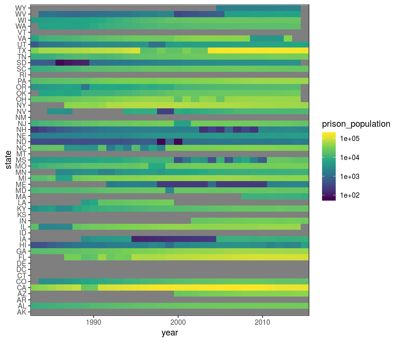
We can hypothesize that the sharp changes in the prison_population variable are caused by missing data, rather than by real changes in the population of prisons.
2.2 A more solid strategy
As a more solid strategy to deal with missing values, we can keep only measurements from counties in which the variable prison_population never has missing values.
For example, if in a county we did not count the prison population for two years, and we thus have missing values, when we sum the data for those county to the others ignoring NAs, we would notice a sharp increase and decrease in prison population, that is not reflected in reality.
It is better to remove measurements from that county altogether. In this way we may lose some measurements. But the time series that we retain reflects better the real trends in prison population.
(If we needed to retain more measurements, we could have tried to impute missing values, but in this case we don’t need to. Because we should have already enough measurements to make insightful observations).
We can use dplyr to create the new variable has_na that is TRUE if any measurement from that county contains missing values. And then we can use to filter out those observations.
dat_clean <-
  dat %>%
  filter(pop_category == "Total",
         # to include more counties, I have reduced the time span
         year >= 1990,
         year != 2016) %>%
  group_by(state, county_name) %>%
  mutate(has_na = anyNA(prison_population)) %>%
  filter(!has_na) %>%
  ungroup()
Let’s do again the heatmap, but after we have removed counties with missing values.
dat_clean %>%
  # first summarize data by state and year
  group_by(year, state) %>%
  summarise(prison_population = sum(prison_population),
            population = sum(population)) %>%
  # then plot the heatmap
  ggplot(aes(x = year,
             y = state,
             fill = prison_population)) +
  geom_raster() +
  scale_fill_viridis_c(
    # trans = "log10", breaks = 10^(1:5)
    ) +
  # Do not add padding around x limits
  scale_x_continuous(expand = expand_scale(0))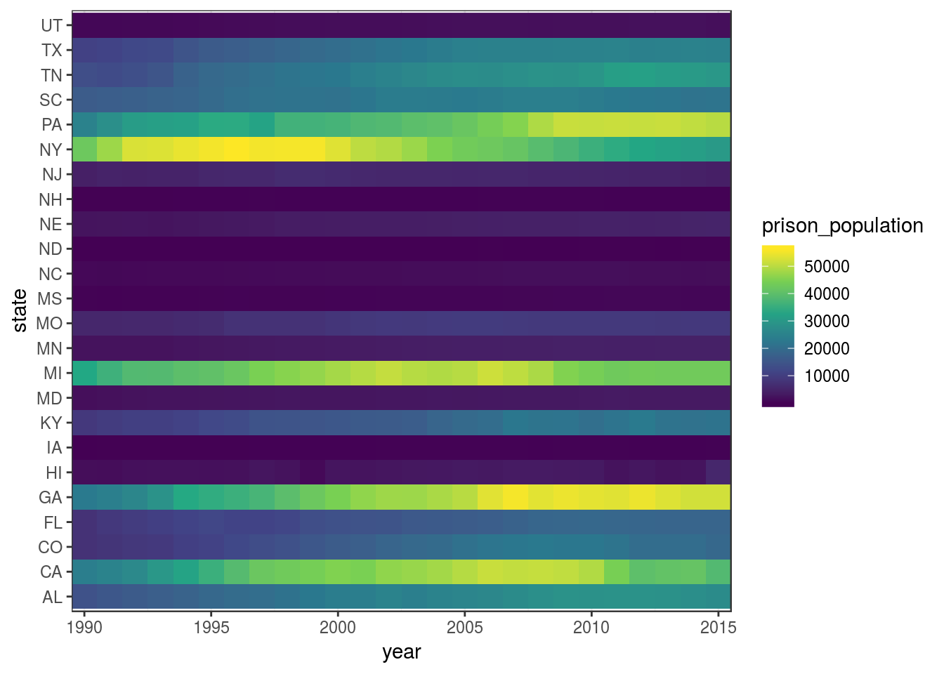
(If you compare this heatmap with the one before, you’ll notice that here the colour scale is mapped to a linear scale, rather then a log scale, because in this case the differences are so smooth that they get imperceptible in log scale.)
Now the progression through time is much smoother.
As you notice, I have restricted the time span from 1990 to 2015 to retain more counties. Nevertheless, we have lost information about many states.
# Which State is missing in the clean dataset?
setdiff(dat$state, dat_clean$state)
## [1] "AK" "AZ" "AR" "CT" "DE" "DC" "ID" "IL" "IN" "KS" "LA" "ME" "MA" "MT"
## [15] "NV" "NM" "OH" "OK" "OR" "RI" "SD" "VT" "VA" "WA" "WV" "WI" "WY"We can anyway go on, apply this system to remove NA to the observations split by gender and ethnic categories, and test on that dataset which category is overrepresented in prison population.
3 Which Category is Overrepresented?
First, we can clean from missing values the observations that are split by categories.
# Try with more details ---------------------------------------------------
by_cat <-
  dat %>%
  filter(
    pop_category != "Other",
    year >= 1990,
    year != 2016) %>%
  group_by(state, county_name, pop_category) %>%
  mutate(has_na = anyNA(prison_population)) %>%
  filter(!has_na) %>%
  ungroup()
3.1 Exploratory plot
Then we can produce some plots to explore how the various categories behave. In this case I’ve found this boxplot most helpful.
by_cat %>%
  mutate(ratio = prison_population/population) %>%
  ggplot(aes(x = year,
             y = ratio,
             group = year)) +
  geom_boxplot() +
  scale_y_log10() +
  facet_grid(pop_category ~ .,
             scales = "free",
             # Wrap the text in the strip labels
             labeller = label_wrap_gen(width = 10))
## Warning: Transformation introduced infinite values in continuous y-axis## Warning: Removed 47965 rows containing non-finite values (stat_boxplot).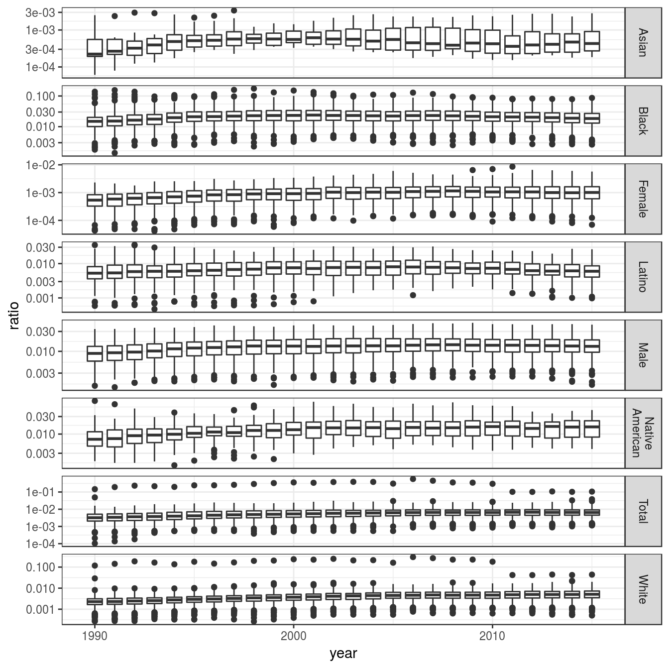
Above, we can observe that:
- The ratio of African american [Black] incarcerated is higher than any other category, with median around 0.02.
- The ratio of males incarcerated is very high, with median going from 0.01 to 0.02.
- The ratio of
LatinoandNative Americanincarcerated are also high.
Just to be sure, we can also reproduce the same heatmap as above on all categories.
by_cat %>%
  mutate(ratio = prison_population/population) %>%
  ggplot(aes(x = year,
             y = state,
             fill = prison_population)) +
  geom_raster() +
  facet_grid(. ~ pop_category) +
  scale_fill_viridis_c(trans = "log10", breaks = 10^c(1:5)) +
  # because of facetting, the x axis is very tight
  theme(axis.text.x = element_text(angle = 90, vjust = .5))
## Warning: Transformation introduced infinite values in discrete y-axis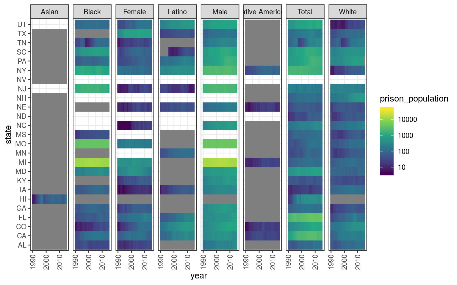
We can see that data are still sparse, but importantly, for each year/category we have sets of paired observation of prison_population and population without missing values.
3.2 Hypergeometric test
We can model this data with an hypergeometric distribution, and use it to test if a category of gender or ethnicity is overrepresented.
First, we can (again) summarize observation by state and year (we don’t want to test over-representation for every county).
by_cat_sum <-
  by_cat %>%
  filter(pop_category != "Other") %>%
  group_by(pop_category, year) %>%
  summarise(population = sum(population),
            prison_population = sum(prison_population)) %>%
  ungroup()
Then we have to prepare the data for the function phyper() that will estimate the p-value of each observation under the hypergeometric distribution.
As state by its help page, the phyper() function requires these parameters:
- q: vector of quantiles representing the number of white balls drawn without replacement from an urn which contains both black and white balls.
- m: the number of white balls in the urn.
- n: the number of black balls in the urn.
- k: the number of balls drawn from the urn.
From the help pages of the stats package
We can reshape the dataset and place each of those values in a separate column. If we call each column as the appropriate parameter of the function phyper(), then we loop this function on each row of the dataset with pmap() and match all arguments automatically by name.
# prepare a table for hyopergeometric test:
# get category total next to each other category

by_cat_tot <-
  by_cat_sum %>%
  filter(pop_category == "Total") %>%
  rename_all(funs(paste0(., "_total")))

by_cat_hyp <-
  by_cat_sum %>%
  left_join(by_cat_tot, by = c("year" = "year_total"))

# apply phyper() using pmap

# Define phyper() wrapper that contains "..."
# So that it can be used in pmap with extra variables
# Test enrichment
# inspired from
# https://github.com/GuangchuangYu/DOSE/blob/master/R/enricher_internal.R

phyper2 <- function(q, m, n, k, ...) {
  phyper(q, m, n, k, log.p = TRUE, lower.tail = FALSE)
  }

by_cat_hyp <-
  by_cat_hyp %>%
  # rename arguments for dhyper
  transmute(year = year,
            pop_category = pop_category,
            q = prison_population, # white balls drawn
            # x = prison_population, # white balls drawn
            m = population, # white balls in the urn
            n = population_total - population, # black balls in the urn
            k = prison_population_total) # balls drawn from the urn
This approach was inspired by the field of genomics and transcriptomics, in which the hypergeometric test is often used to test the if structural or functional categories of genes are enriched in a given set. Some code here is inspired by this bioconductor package
Then we can use pmap() to run an hypergeometric test on each row.
# apply dhyper() to every row
by_cat_hyp <-
  by_cat_hyp %>%
  mutate(log_p = pmap(., .f = phyper2) %>% purrr::flatten_dbl())
And eventually we can plot the log p-values with inverse sign, to make the plot more intuitive.
p <-
  by_cat_hyp %>%
  # I could have filtered out this earlier,
  # but it served as practical control
  filter(pop_category != "Total") %>%
  # filter categories not overepresented
  filter(log_p < -100) %>%
  ggplot(aes(x = year,
             y = -log_p)) +
  geom_bar(stat = "identity",
           fill = "orange",
           colour = "black") +
  facet_grid(pop_category ~ .)

p %>% print()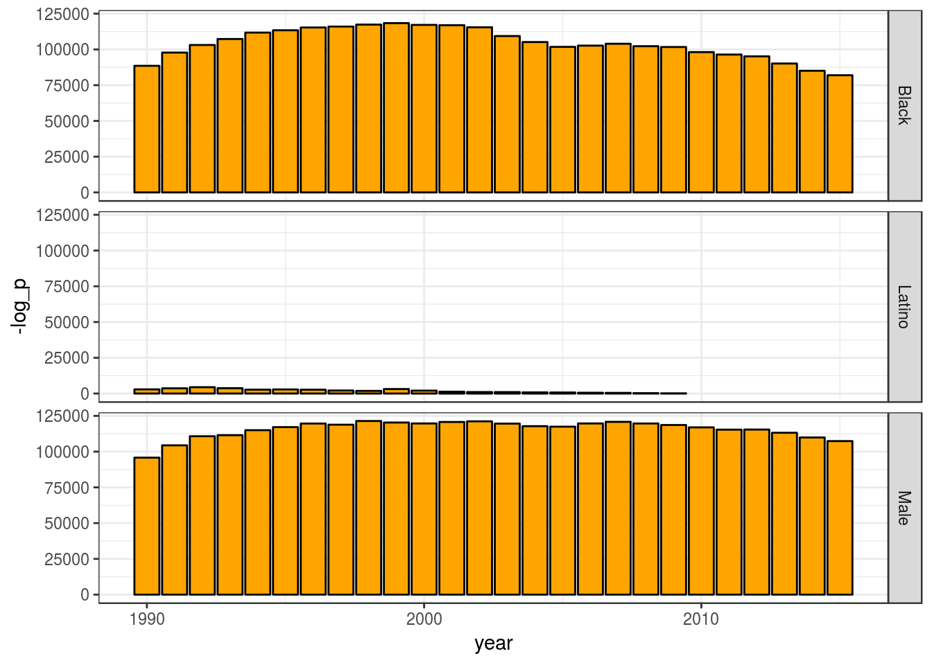
We can see that the categories “Black” and “Male” are far from what we would expect by chance, and, thus, members of that categories are overrepresented.
4 Adjust plot for publication
We can adjust the plot labels for publication. Adding clearer labels, a title, and making small adjustments to the layout.
p2 <-
  p +
  labs(title = "Categories that are Overrepresented in US Prisons",
       subtitle = str_wrap("A quick exploratory analysis of
                           the VERA dataset, using a hypergeometric
                           test to estimate which category is more
                           represented than expected"), width = 27,
       y = "-log(p-value)",
       x = "Year",
       caption = "Source: www.vera.org | Plot by @othomn") +
  theme(text = element_text(family = "Arial Narrow",
                            colour = "grey40",
                            size = 11),
        axis.title = element_text(size = 14),
        strip.text = element_text(colour = "grey20",
                                  size = 14),
        plot.title = element_text(colour = "grey20",
                                  face = "bold",
                                  size = 18),
        plot.subtitle = element_text(face = "bold",
                                     size = 12),
        aspect.ratio = .2,
        plot.margin = margin(t = 10, r = 10, b = 0, l = 3,
                             unit = "mm"))

p2 %>% print()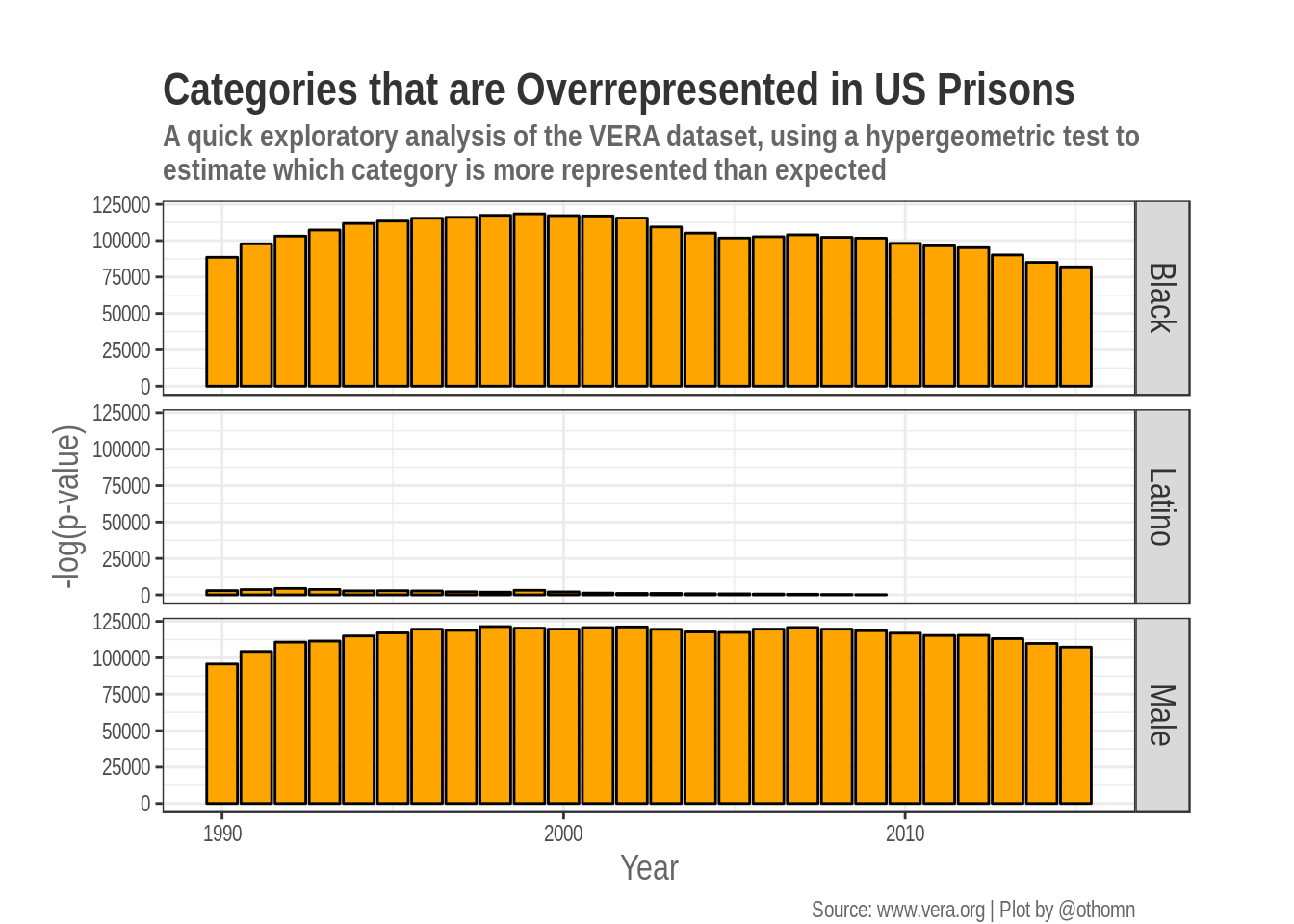
5 Interpretation and closing remarks
This is a quick analysis and my take on Tidytuesday week 4 dataset.
My analysis shows an issue that is widely known, that African American are overrepresented in US prisons. But this just a statistical analysis, which could be helpful or misleading if not contextualized. If you have any suggestion on how to improve my analysis, please contact me.
Unfortunately, in here I don’t contextualize and I don’t discuss this results. If you are interested in this topic, if you feel engaged by these results, and you want to know more. If you want to interpret this data, you’ll have to contextualize this results. To do so, you’ll have to read about history and social issues! And if you are interested and you want to form an opinion, please, please, please, do read, explore and contextualize.
Many thanks to Thomas Mock for bringing the work of the Vera institute to our attention on Martin Luther King Jr. Day.